CellByCell · Shopping and checkout
A clearer storefront for a Korean medical-cosmetics brand entering the U.S. market.
Original artifact from the linked source case. Authorship confirmed by Yejun Tak.
The existing storefront had fragmented product information, unclear navigation, and inconsistent brand presentation. The design reorganized the shopping journey and product storytelling.
I owned the complete shopping flows and visual design as the sole designer, collaborating with marketing and product stakeholders on the brief and brand direction.
No numeric conversion lift, completed usability-study evidence, or launch result is established by the source.
Context and my role
CellByCell is a Korean medical-cosmetics brand expanding into the U.S. market. The design brief called for a stronger digital and visual presence aligned with its premium positioning.
As the sole designer, I owned the end-to-end shopping flows and visual design, including UX/UI, branding, product presentation and LA convention assets. I collaborated with marketing and product stakeholders. Tools: Figma, Photoshop and Illustrator. Duration: 2022–2023.
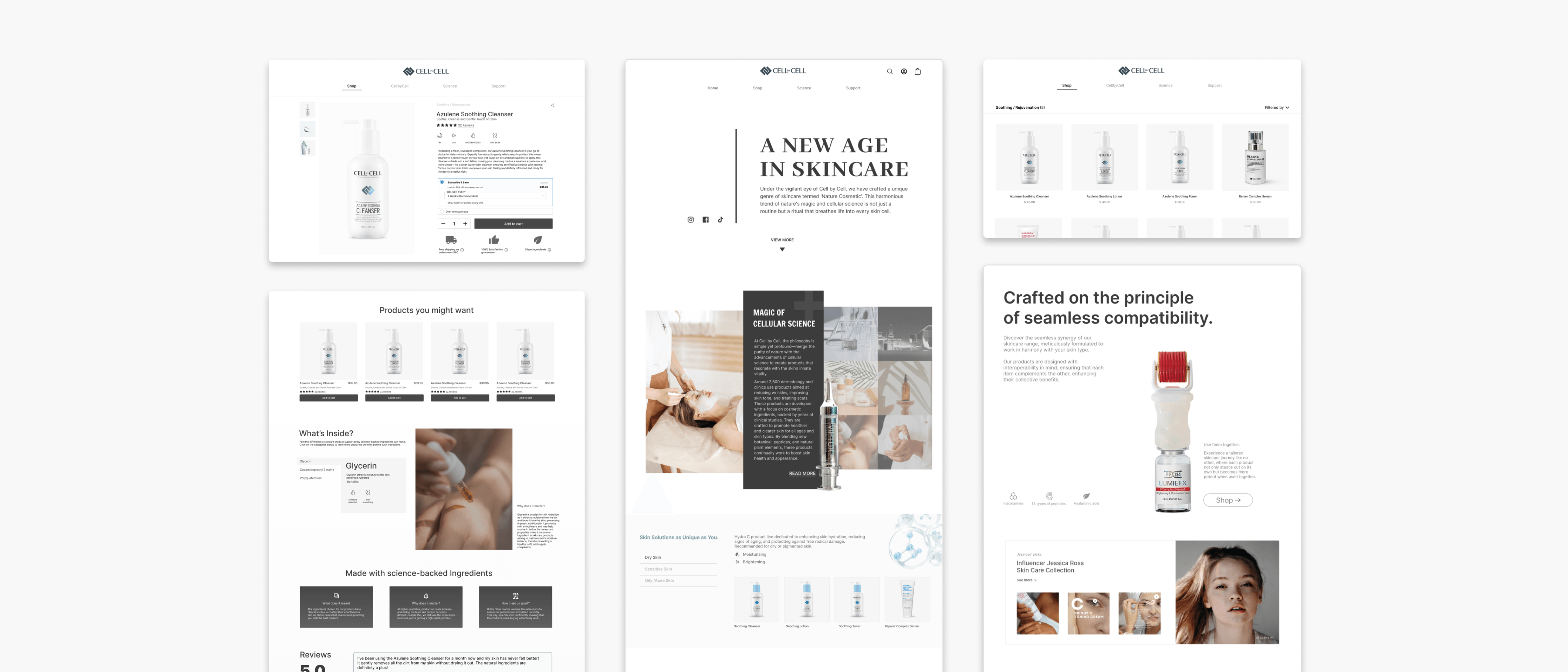
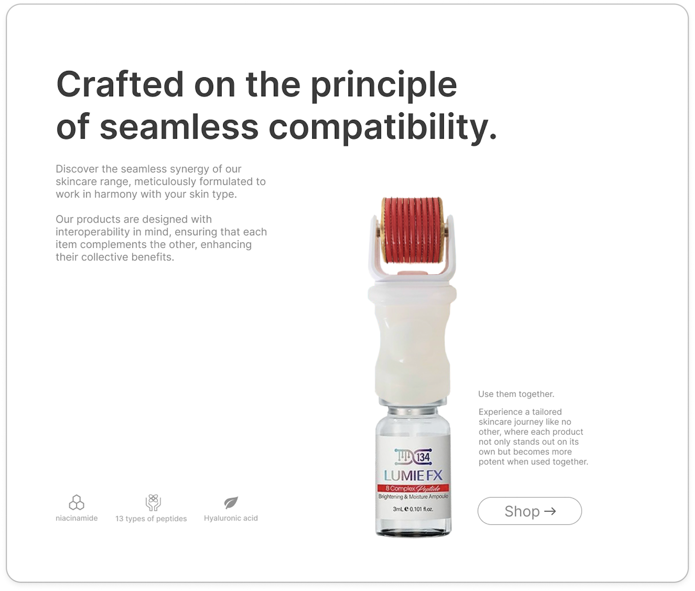
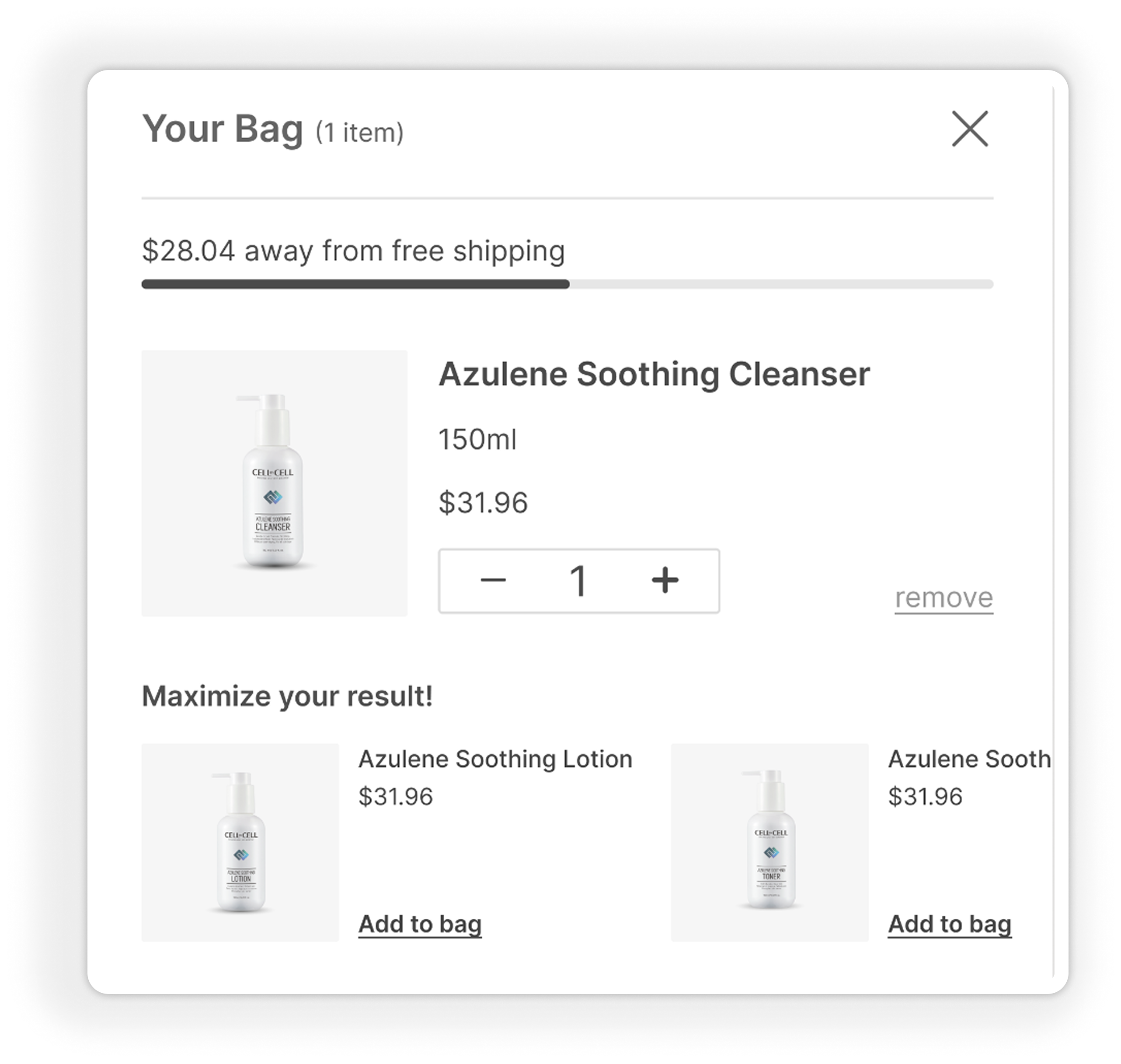
Previous website and objective
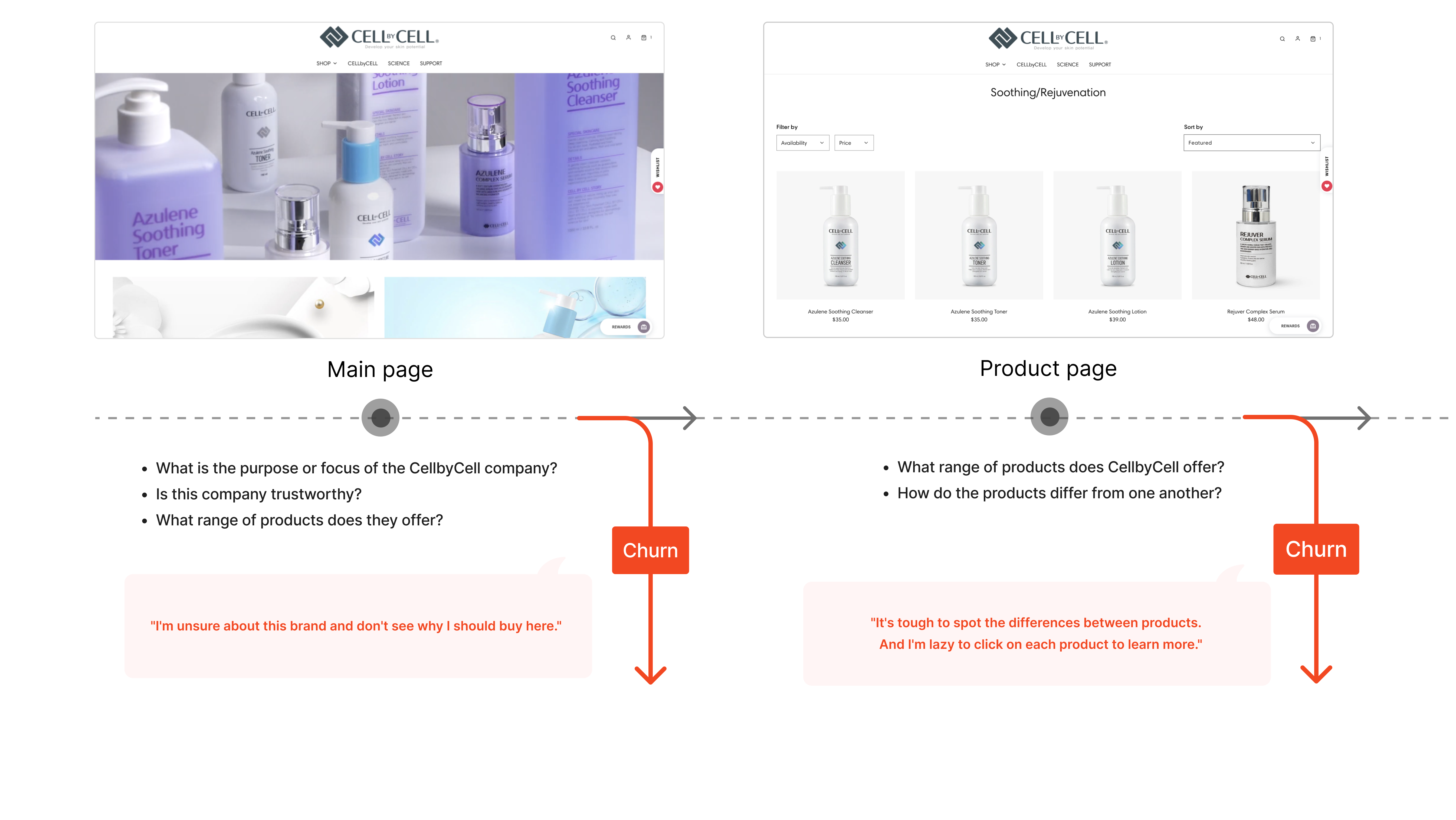
The previous site lacked a cohesive brand identity. Navigation was difficult to follow, product information was scattered, and priority products were not clearly highlighted.
The objective was to clarify the shopping journey through navigation, content structure and product storytelling. Conversion and engagement were design goals; no measured lift is supplied.
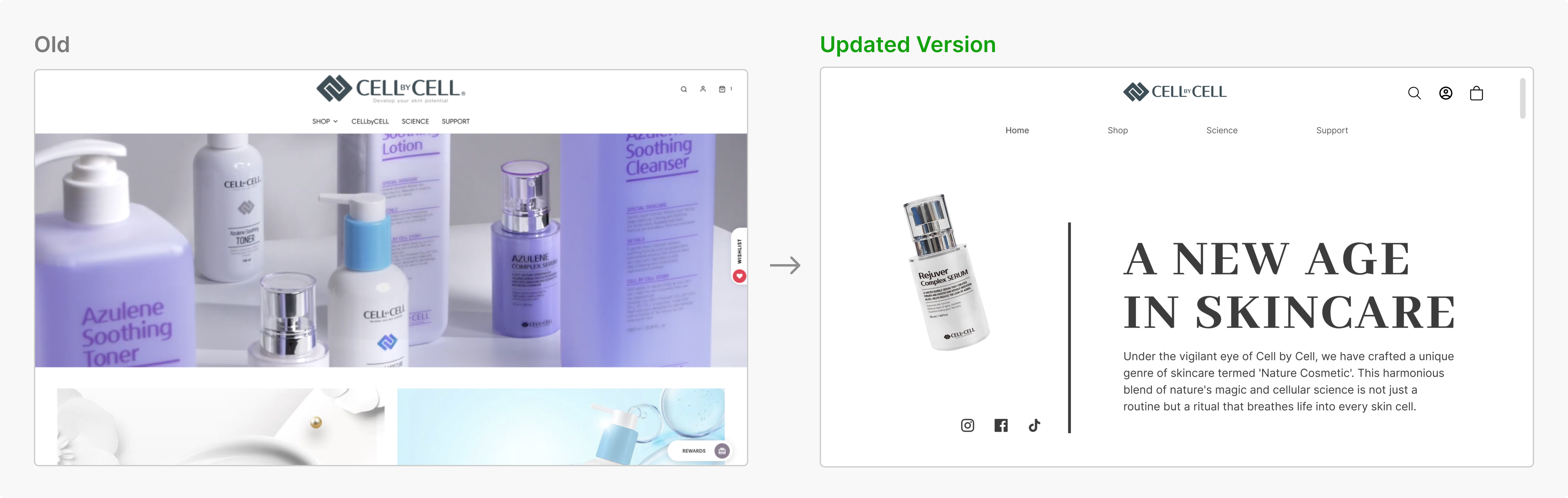
Home / landing page
Storytelling: connect brand identity and product narratives in a cohesive landing experience.
Trust-building information: address common product and brand questions with clear information.
Unique selling point: make distinguishing product features visible while supporting intuitive browsing.
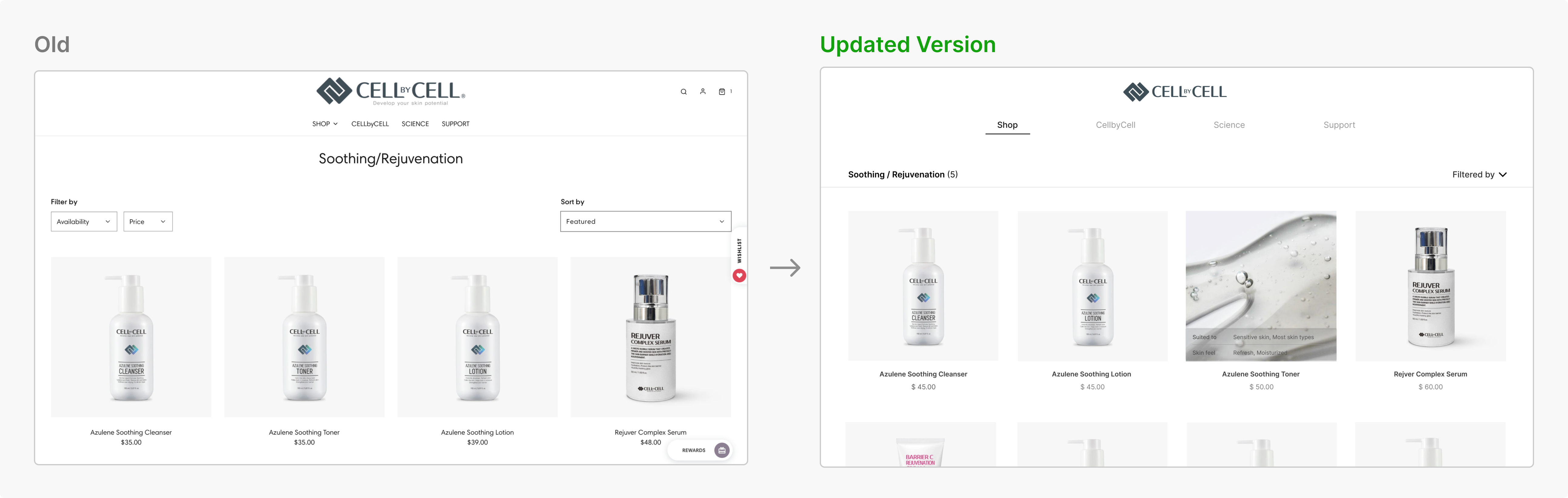
Products page
Simplify filters to retain useful choices for finding products.
Support intuitive comparison so customers can distinguish products and make an informed selection.
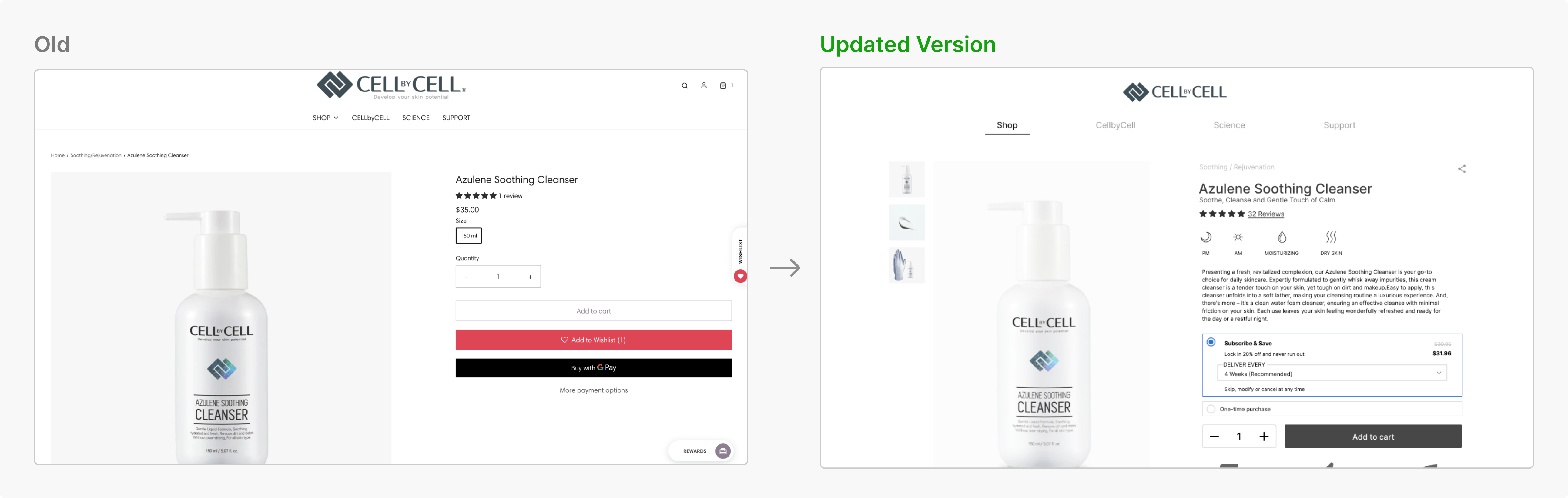
Product detail page
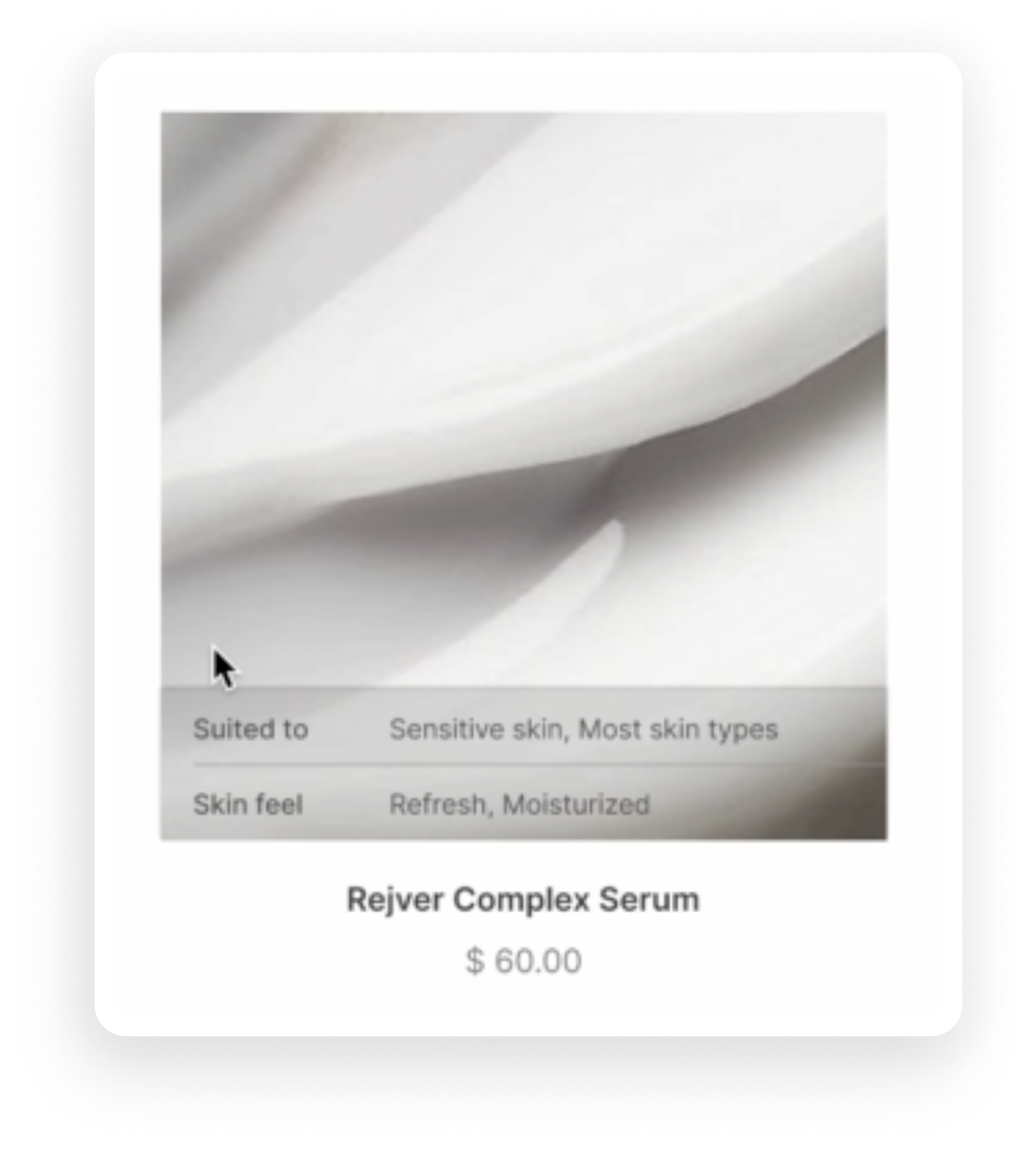
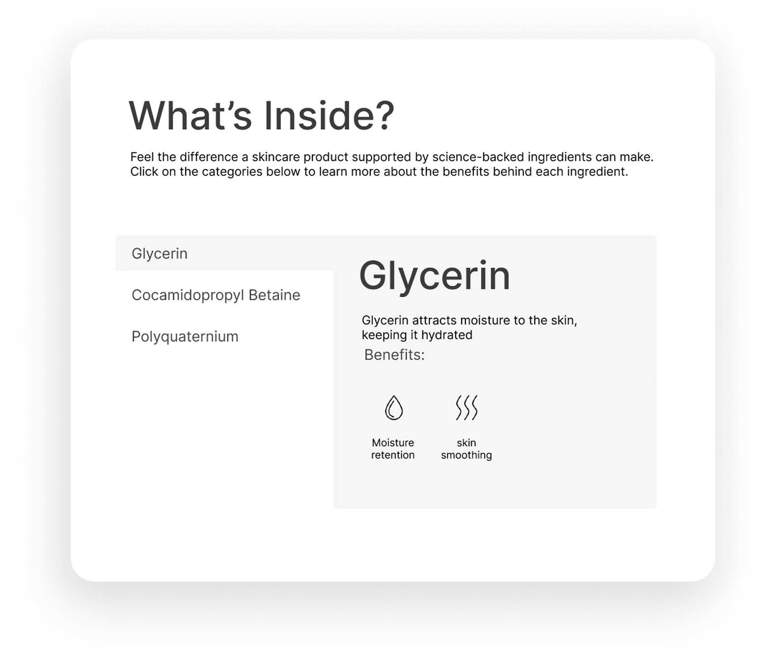
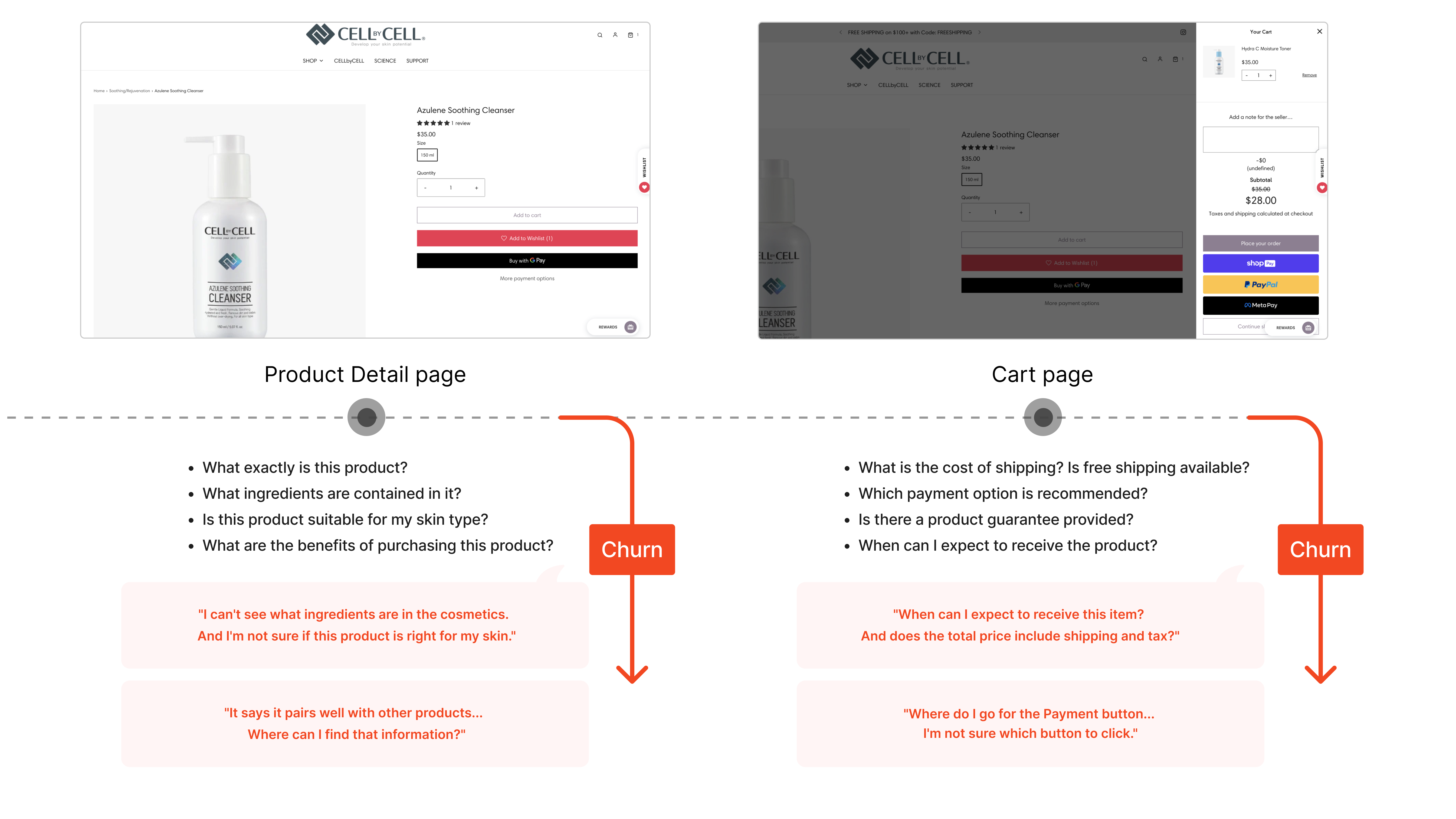
Present ingredients, form, texture and suitable skin types clearly.
Show related products and series to help people discover the available product range.
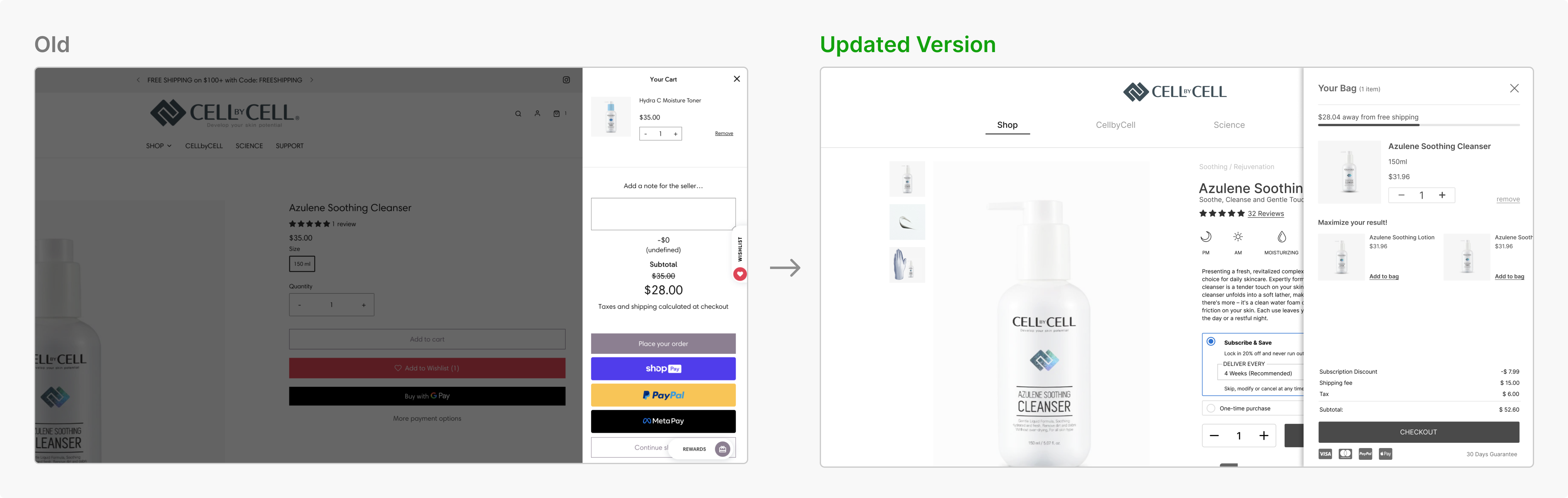
Cart page
Reduce competing payment actions, explain shipping time and price, and make the total calculation easier to understand.
Landing page demo
Original landing-page demonstration. The original video is copied locally and plays below.
Product page demo
Original product-page demonstration, served as a local copy of the source video.
Product detail demo
Original product-detail demonstration, served as a local copy of the source video.
Reflection and evidence limits
The preserved design decisions connect storytelling, product discovery and purchase clarity. The hosted source contains no separate retrospective, measured usability results, or verified release outcome. Those gaps remain explicit rather than supplying an invented reflection.